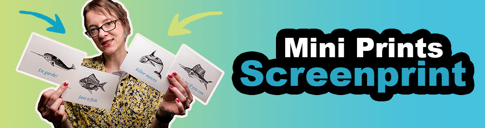
Ocean Sass in Mini Format: My New Mini Print Set
Sitting on my balcony in Berlin. It’s rather cold for a summer day in late July. 22 degrees and windy, but luckily the sun peeks through the clouds every now and then. I can’t say the balcony plants look very healthy. It’s definitely not the lack of water, since it’s been raining a lot this month. So it must be me.
Sipping on my third coffee, which some might say is a bit late at 4 pm, I listen to a few dead linden leaves skittering across the floor, pushed around by the wind.
Usually when I sit here, there’s a pigeons couple hanging out on a branch of that tree, making their usual bird sounds. But not right now. Instead an ambulance wails somewhere in the distance. The last two months were a bit stressful. Things had been bothering me, but they are finally coming to an end, just in perfect time for my long-planned vacation.

Finally screen printing
Happy I could finally get around to printing my four mini screen prints based on my ocean animal illustrations. The screen had already been burned weeks ago, but I hadn’t found a free weekend to actually print them.
I recorded the process for YouTube (you can find the video at the bottom of the post).

Why this set?
I thought it would be sweet to pick out a few of my ocean animals and add a bit of humor to each one.
The Narwhal – “En garde!”
Narwhals don’t actually use their long “unicorn” tooth for fencing, but rather as a sensory organ to detect water temperature, movement, and more. Still, I liked the idea of imagining them in a sword fight.
The Sailfish – “Catch me if you can”
Apparently, the sailfish is the fastest fish in the ocean. So this one pretty much named itself.
The Orca – “Killer moves”
Instead of focusing on their dramatic “killer” reputation, I wanted to highlight their elegance. Orcas are intelligent predators with impressive hunting strategies. They prey on other ocean animals like fish, seals, and even whales, but they don’t harm humans in the wild.
The Fish – “Just a fish”
It’s totally fine to just be what you are. No need to impress anyone. You are enough.
Preperation
I usually print on DIN A4 paper. Since I planned to make mini prints in postcard size (DIN A6), it worked out perfectly. Four A6 prints fit exactly onto one A4 sheet, which makes cutting later super easy. This also means I didn’t need to add crop marks. Those would have to be placed outside the design and wouldn’t fit on A4 anyway. I would have needed larger paper.
I separated the colors (black and peacock blue) into two individual print files, since each one needs to be burned onto its own screen to create two separate stencils. The marks you see in the design files are registration marks. Those will be part of the stencil and are important to help me align the paper correctly under the screen later. I’ll mask them off with masking tape once the paper registration is done.

This is the first time I’m using these kinds of “E-tabs” or “registration tabs” (or whatever they’re called) to position the paper on the platen always in the same spot during printing. I recreated them from a photo I found in a Reddit post and had a few laser-cut. I wasn’t sure what material they were made of, but I assumed some kind of thin plastic. There weren’t many options, so I went with 0.8 mm polypropylene, still not totally sure what that even means. But they seem stable and flexible enough to slide the paper under the middle circle (see pictures below).


I only got the tabs to see if they hold down my paper. I don’t have a vacuum table, so paper usually sticks to the screen if I don’t use tack spray. But tack spray needs to be reapplied every 10–15 prints, and the sticky mess ends up everywhere. Constant cleanup. Extremely annoying.
With the E-tabs (I use 3), the paper stays in place because the middle part of the tab is on top of the paper and can hold it down. No more tack spray needed for this paper size. Not sure how well it will work with bigger sized paper. Will test.
BUT: If your paper is thin or smooth, you might see pressure marks from the middle part of the tab if the squeegee runs over it. Handmade or thick cardboard papers were fine though. Also, if my artwork is close to the tab, print quality may suffer in that area. Moving the tab fixed it for me.
One more thing: If the squeegee hits the tabs often, it can damage the screen emulsion in that area. Not really dramatic for me, I just tape it off or use filler later. Still, probably best to avoid?
What I could try to do next time is make the artwork smaller so I can have more safe space around it and use a smaller squeegee to avoid running over the tabs altogether. I’ll keep testing. Because tack spray sucks!
Printing
Printing the text in Peacock Blue from Speedball. I really like it. The ink was thinner than I expected though. So far, I’ve only used inks from Siebdruckersand, but they didn’t have a turquoise tone, and I’m just lousy at mixing my own colors. Something I definitely need to practice at some point.
I always use water-based inks, by the way. For the text, I used an 80T mesh, and for the more detailed animals, a 100T mesh.

Here you can see the final results: the text printed in blue, and the animals printed in black on top. If you want to know how I aligned the colors and screens precisely, check out the video at the bottom or this previous blog post.

Cutting
After I finished the two printing sessions, I let the prints dry on the rack for a few hours and then started cutting the A4 sheets first to A5 format, and then the A5 sheets to the final A6 format. With a cutting machine that has grid lines the trimming is very easy to do.

Of course you can find the set in my Etsy shop! Hehe. So not only handprinted but also handcut ;).
The mini print set is now available in my Etsy shop.

Check out my YouTube video on this topic! It explains also parts that are not covered in this blog post.
Like most of my videos where I talk, it is in german, but you can turn on EN subtitle.

Upcoming blog post:
After my vacation, I’d like to try a split fountain with one of my designs. It’s a technique where you blend two or more ink colors directly on the screen to create a gradient in a single pass. The illustration is ready, but I still need to burn it onto a screen before I can print. So maybe we’ll read each other here again in a month or so.
Newsletter Update:
Sometime after my vacation. In the meantime you can sign-up here if you haven´t :).